 |
ILLUSTRATING PARADISE LOST
|
|||||||||||||||||||
 |
|
'Adorn'd with Sculptures'
Paradise Lost's illustrations have played an important part in shaping the poem we know today. Our story begins towards the end of the seventeenth century. Published by Samuel Simmons in 1667, the first edition of Paradise Lost had been a run-of-the-mill affair, even compared to Milton's earlier collection of shorter poems. The first copies were modest volumes with no portrait, no preface, no dedicatory verses. At first it sold very slowly, prompting Simmons to print several new title pages in an attempt to drum up interest at the bookstalls. The poem's popularity gradually grew, but by 1687, no new edition of Paradise Lost had appeared on the shelves for a decade. Milton seemed destined to be remembered as one of those great, unread English poets.
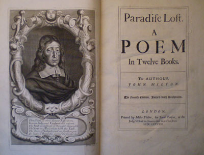
In 1688, everything changed. The publisher Jacob Tonson, whose list of fashionable contemporary authors included Dryden, Pope and Addison, obtained the rights to Milton's poem and grabbed the chance to turn it into a classic. That year he released the fourth edition of Paradise Lost, whose title page advertises it as 'Adorn'd with Sculptures' (then a common term for engravings). Unlike the previous editions, this one was large (about the size of a modern coffee table book), beautifully printed, ornamented with twelve full-page engravings by prominent European artists, and very expensive. At its head was a lavish portrait, whose accompanying epigram by Dryden compared Milton to the great classical poets, Virgil and Homer. In short, this book was monumental. A canny fashioner of literary identities, Tonson had realised that pictures sold books, and in doing so, set Milton on the path to becoming a national classic.
|
 |
|
'Darkness Visible'
It is a commonplace to say that Paradise Lost has been a rich source of imagery for artists. But when we slip into talking about a poem's 'imagery', or 'images', what do we actually mean? As we read Milton's poem does a kind of revolving picture gallery of Hell, Heaven and Eden pass through our minds? Paradise Lost may be a fertile subject for illustrators, but it also presents them with some challenging difficulties.
The Flames of Hell
The great ninteenth-century landscape painter J.M.W. Turner (who himself painted several watercolours for Paradise Lost) proposed in one of his Royal Academy lectures that 'the greatest richness of verse is often the least pictorial'. As Turner implies, Milton's poetry is at once vividly visual and extremely hard to visualize. Take the panorama of Hell that faces Satan upon his fall:
At once as far as angel's ken he views
The dismal situation waste and wild,
A dungeon horrible, on all sides round
As one great furnace flamed, yet from those flames
No light, but rather darkness visible
Served only to discover sights of woe... (I.59)
 |
|
In words like 'views', 'sights', 'visible' and 'ken' (now a rare word that means the range of someone's vision), Milton is repeatedly telling us that there is something to see here. First he sketches out some of the traditional topography of Hell: it is 'waste and wild', a 'dungeon horrible' filled with fire. But as so often in Paradise Lost, Milton's description of the scene turns upon a simile - 'As one great furnace flamed' - and, more particularly, upon the following word 'yet'. Milton's simile conjures up before the mind's eye the image of a roiling furnace, before saying 'no, Hell is not as simple as this'. We can only see Hell's fires by putting together in our imaginations two things that, in reality, are totally opposed. This is what Milton does in the famous oxymoron that gives this website its name: 'darkness visible'.
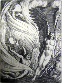
Illustrators of Paradise Lost have tried in various ways to represent these infernal fires. The artist of the 1688 edition tips his flames with black, bathing the fallen angels in a stark, unnatural light. William Strang's etching of 1896 creates a billowing curtain of fire that engulfs the whole composition. Yet what these efforts demonstrate, perhaps, is how unequal the human mind is to the task of imagining a region fiercely illuminated by the absence of light.
Invisible Exploits
In Book V, Adam asks the angel Raphael to describe the fall of Satan. Raphael finds himself in the same difficulty that Milton faces: 'how shall I relate | To human sense the invisible exploits | Of warring spirits' (V.564). Raphael soon resolves to make his tale more comprehensible to Adam and Eve by 'likening spiritual to corporal forms' (V.573).
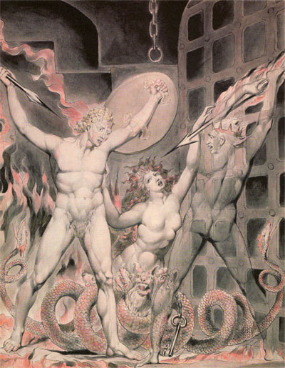
But how should the illustrator of Milton's poem frame such 'invisible exploits'? Illustrations of Paradise Lost's Death, who confronts his father Satan at the end of Book II, are an interesting case. Milton's description makes clear that his Death is an insubstantial, shadowy thing:
The other shape,
If shape it might be called that shape had none
Distinguishable in member, joint, or limb,
Or substance might be called that shadow seemed,
For each seemed either; black it stood as night,
Fierce as ten Furies, terrible as hell,
And shook a dreadful dart; what seemed his head
The likeness of a kingly crown had on. (II.666)
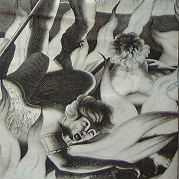
Death does have some iconographical attributes: it sports a 'dreadful dart' and 'kingly crown'. But they are certainly not the traditional ones of the danse macabre, with its robed skeletons and scythes. Milton's threefold repetition of 'shape' underlines the fact that this limbless entity is constantly shifting out of vision and substance. However, the majority of illustrators over the centuries have chosen to depict Death in his customary skeletal guise. Such are the pressures of artistic tradition on the one hand and the visual medium on the other, that the engravers override Milton to create a firmly 'corporal form'.
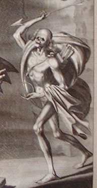
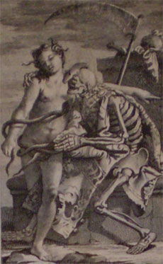
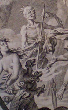
Three engravings of Paradise Lost's Death |
||
 |
 |
 |
John Baptist de Medina [?], 1688. |
Giambattista Tiepolo, 1742. |
Francis Hayman, 1749. |
William Blake's 1808 watercolour of the confrontation between Satan, Sin and Death is arguably the closest illustration to Milton. Blake takes as his cue the line 'Or substance might be called that shadow seemed' (II.651). Blake made a point of never painting in oils, which he found slick and overly solid, unsuited to the ethereal subjects he so often chose to depict. He uses the luminosity of watercolour paint to his advantage. Watercolour's ability to be layered in transparent washes creates a vision of Death as a terrible shadow, which begins to approximate Milton's own:
William Blake, Satan, Sin and Death, 1808, watercolour.
Pictures in Time
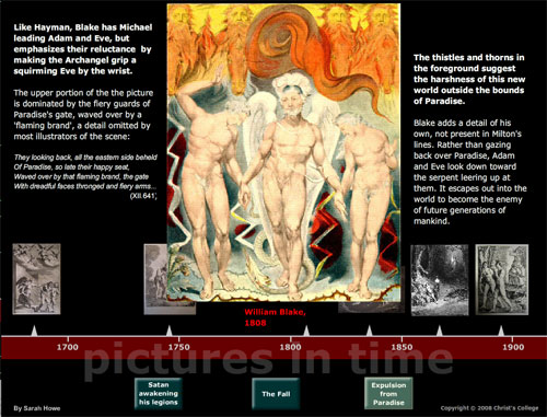
We can learn a lot by comparing how different artists have tackled the same Miltonic scene. Each picture throws a different light on the passage, picking out and suppressing different aspects of Milton's description. The following interactive popup, Pictures in Time, compares versions by different artists of three key scenes spread through the course of Paradise Lost: Satan rousing the Fallen Angels (Book I), the Fall (Book IX), and the Expulsion (Book XII).
Does Satan have horns? Did Michael drive Adam and Eve out of Eden or lead them gently by the hand? Whose fault was the Fall? All these questions have subtly different answers according to who is drawing the pictures and when they are doing so...
Picturing Paradise through the ages
(This requires the Adobe Flash Player.)
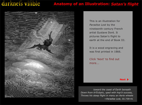
Anatomy of an Illustration: Satan's Flight
The following popup, Anatomy of an Illustration: Satan's Flight, takes an in-depth look at a single illustration by the nineteenth-century French artist, Gustave Doré. Satan's flight to earth at the end of Book III has never been a popular subject among artists, making Doré's version all the more unusual.
Take off!
(This requires the Adobe Flash Player.)
Further Reading
 Robert Woold, Howard J.M. Hanley, Stephen Hebron, Paradise Lost: the Poem and its Illustrators (Grasmere: the Wordsworth Trust, 2004).
The best introduction to Paradise Lost and its artistic interpreters, this beautifully illustrated book started life as the catalogue of a Wordsworth Trust exhibition in 2004. It charts a fascinating path through the most celebrated artists to tackle Milton, setting them alongside some lesser-known gems.
![]() Marcia R. Pointon, Milton and English Art (Manchester: Manchester University Press, 1970).
Marcia R. Pointon, Milton and English Art (Manchester: Manchester University Press, 1970).
Pointon's book is still the place to go to explore Milton's poetry as a source for eighteenth- and nineteenth-century English art. Even a brief skim through the illustrations gives a vivid sense of what Paradise Lost meant to these different periods.
Stephen C. Behrendt, The Moment of Explosion: Blake and the Illustration of Milton (London: University of Nebraska Press, 1983).
A more in-depth and scholarly look at Blake's illustrations. The second half is a detailed comparison of Blake's 1807 and 1808 Paradise Lost watercolours (complete with full-page colour prints), showing how his ideas changed and developed.
LEARN ABOUT MILTON AND THE ARTS...
Illustration: Picture Gallery
| Copyright © 2008 Christ's College |
 |